Windows 11 brings many new features and improvements over Windows 10, including a completely redesigned Start Menu. By default, it’s now centered on the desktop, without live tiles, and much simpler compared to its earlier iterations from previous Windows operating systems. Many have already embraced Windows 11 and love the new Start Menu, albeit the things you can’t do with it. Unfortunately, some of us here at Digital Citizen don’t feel the same way, as the things missing from Windows 11’s Start Menu are pretty annoying. Here’s what we don’t like about it:
Contents
- 1. There are no live tiles in Windows 11’s Start Menu
- 2. You can’t remove the Recommended section from the Start Menu
- 3. Windows 11’s Start Menu can’t be resized
- 4. You can’t make the Start Menu go fullscreen
- 5. You can’t create folders or group icons in Windows 11’s Start Menu
- Do you like or dislike the Start Menu from Windows 11?
1. There are no live tiles in Windows 11’s Start Menu
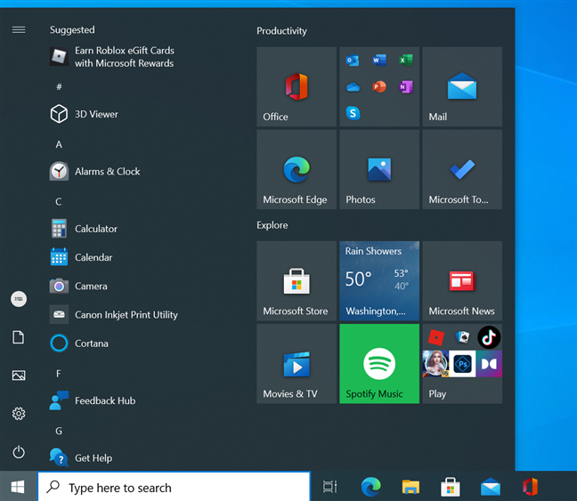
Although I like Windows 11 in general, one of the things I dislike most about it is the fact that Microsoft decided to discontinue live tiles on the Start Menu. I’m pretty sure that some users feel the same way. Although when they first appeared in Windows 8, people had a complicated love and hate relationship with live tiles, many of us have grown fond of them. Live tiles allowed you to easily get pieces of information from your favorite apps. I especially loved the live tiles of the default Mail, Calendar, and Weather apps from Windows 10.

Live tiles in Windows 10's Start Menu
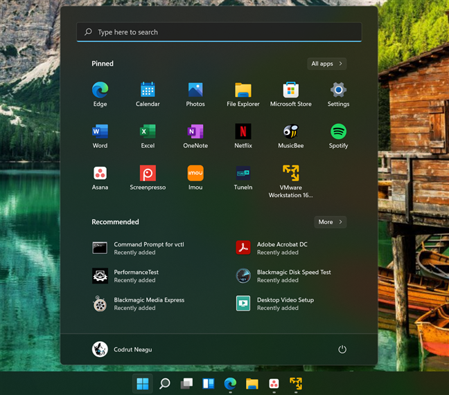
Gone are those days: Windows 11’s Start Menu doesn’t have live tiles at all, only regular shortcuts with static icons that don’t tell you anything. Simplification is good, no question about it, but simplification at the cost of functionality?

Windows 11's Start Menu doesn't have live tiles
2. You can’t remove the Recommended section from the Start Menu
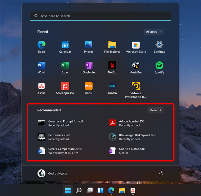
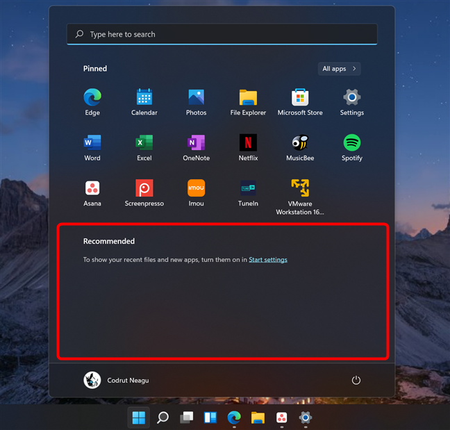
The second thing I dislike most about Windows 11’s Start Menu is the Recommended section. It’s designed to automatically show you a list of the recent apps and files you’ve installed or opened.
In theory, it could be useful. In practice, it’s not. At least in my case, the Recommended section “recommends” only useless things. I’ve seen it often show shortcuts to files that absolutely don’t interest me, as well as apps and files that no longer exist, simply because I’ve had them for a short while. There’s a lag between what Windows 11 lists in Start Menu’s Recommended section and what’s really found on my computer.

The Recommended section from Windows 11's Start Menu
After using Windows 11 for a while and seeing that the Recommended things in its Start Menu are not something I use, I thought “Well, that’s it, I’ll just disable it.” Surprise: you can disable the Recommended list, but it doesn’t disappear - it just stays there taking up space on the screen for no reason, telling you that you should enable Windows 11’s recommendations. What’s up with that?

You can't remove the Recommended list from Windows 11's Start Menu
TIP: Luckily, you can improve certain aspects of the Start Menu, by following the tips from this guide: How to personalize your Start Menu in Windows 11.
3. Windows 11’s Start Menu can’t be resized
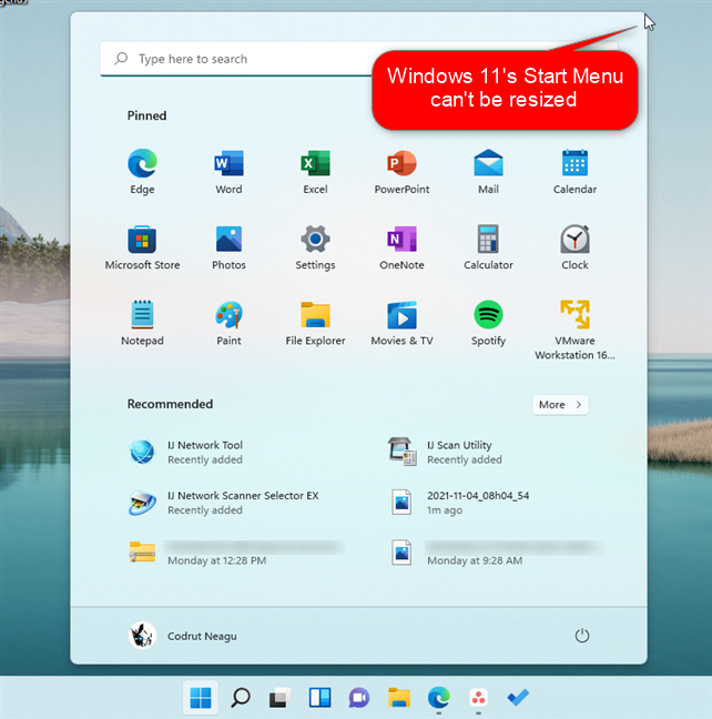
In Windows 10, you could resize the Start Menu to make it fit your needs, whether that meant making it larger or smaller, wider or taller. But hey, who wants to do that? Nobody, according to Microsoft, which decided that Windows 11’s Start Menu should be fixed in size, right there in the middle of the screen. We, users, shouldn’t be able to adjust the size of the Start Menu to fit more icons on it or make it slimmer. Even if the Start Menu is one of the most important things in any operating system, Windows 11 stripped most of the functionality it had in Windows 10.

Windows 11's Start Menu can't be resized
TIP: If you want to change the position of the Start Menu, read: How do I move the Windows 11 Start Menu to the left?.
4. You can’t make the Start Menu go fullscreen
I have friends who work as videographers and video editors. Almost all of them need to use lots of apps on their computers to do their jobs. And one of the things I’ve noticed is that most of them prefer to have the Start Menu in full-screen mode, as that makes it easier to see all their apps and identify the ones they need to open faster. They’re visual people and belong to a special kind of power users who don’t necessarily like to use the keyboard to search and find apps quickly.
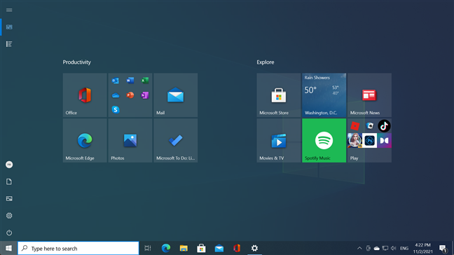
They prefer to see everything at once, hence the full-screen Start Menu. Windows 10 allows it. Windows 11 does not, and for this apparently small reason, there are people who refuse to switch to it and prefer to continue using Windows 10.

Windows 11's Start Menu can't go full-screen like in Windows 10
5. You can’t create folders or group icons in Windows 11’s Start Menu
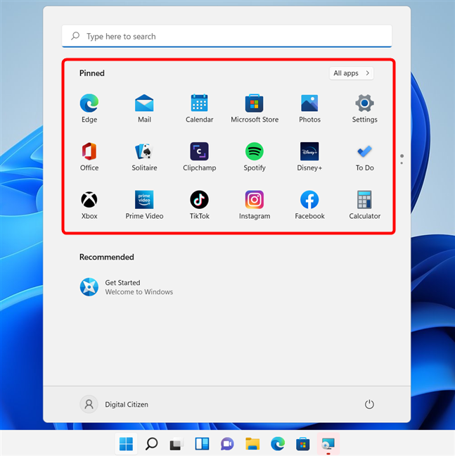
When you install Windows 11, the first thing you see is the desktop and the Start Menu opening. It only takes a quick glimpse to see that the Pinned section from the Start Menu shows a muddle of apps in no particular order. It’s just a mix of apps that are either installed by default or promoted by Microsoft for no particular reason. They’re not arranged alphabetically, they’re not sorted by any obvious criteria. It’s just a pile of things that you may or may not want to use. So, one of the first things you probably will do after installing Windows 11 is trying to sort and organize your Start Menu. I know I did.

The Pinned section from Windows 11 could be improved
Unfortunately, you’ll soon find out that you can only drag and drop icons to rearrange them, but you can’t create folders or groups of icons of any sort. Ah, and keep in mind that the Pinned section can only hold eighteen icons. If you pin more than that, you end up with additional pages which you have to scroll through. That practically makes it pointless to pin your favorite apps to the Start Menu because you could very well just scroll through the list of All apps instead.
TIP: For everything you can do with the new Start Menu, read: How to use the Windows 11 Start Menu.
Do you like or dislike the Start Menu from Windows 11?
Although I like many things about Windows 11, the new Start Menu is not one of them. Now you know why. Because of these small, but essential things you can’t do with it, Windows 11’s Start Menu sucks, in my view. Do you feel the same, or do you like it despite its obvious flaws? Let us know in the comments below.
