Do you know how to draw charts in PowerPoint ? Let's learn everything about drawing charts and graphs in Microsoft PowerPoint with WebTech360 !
- Microsoft PowerPoint Online
- Microsoft PowerPoint
- Microsoft PowerPoint for iOS
- Microsoft PowerPoint for Android
Charts are tools you can use to convey data in the form of visual graphs. Including a chart in the presentation allows your audience to see the meaning behind the numbers. From there, they easily compare and grasp the trend.
How to use charts in PowerPoint
- Types of Charts in PowerPoint
- Identify the parts in the chart
- Insert a chart into a PowerPoint slide
- Insert a chart
- Create charts using existing Excel data liệu
- Edit PowerPoint charts with tools
- Change chart style
- Transfer rows and column data
- Change chart layout in PowerPoint
- Change chart style
- Video tutorial for using charts in PowerPoint
see more
Types of charts in PowerPoint
PowerPoint offers several types of charts available, helping you choose the most suitable data presentation. To use this feature effectively, you need to understand the differences between the chart types in PowerPoint.
Each type of chart in PowerPoint has its own advantages, including:
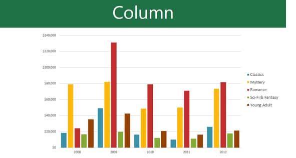
Column: Column chart uses vertical bars to represent data. They can handle many different data types, but are mostly used to compare information.
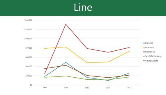
Line : Line charts are ideal for showing trends. The data points are connected by straight lines, making it easy to show increases or decreases in values over time.
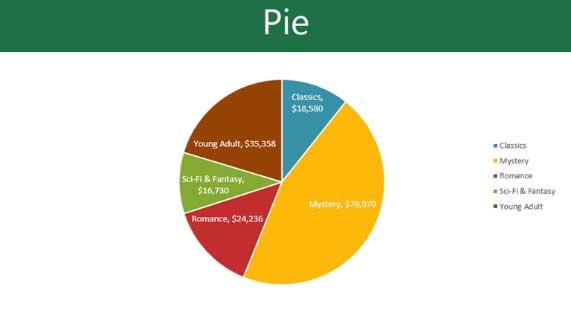
Pie : Pie chart makes it easy to compare ratios. Each value is shown as a part in a circle. Therefore, it is easy to see what percentage of the total data each value represents.
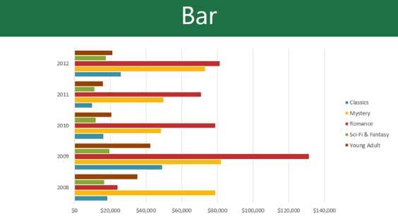
Bar : Bar chart similar to a column chart. However, instead of vertical columns, you must use horizontal bars to illustrate the data.
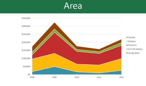
Area : An area chart is similar to a line chart, except that the areas below the line are colored.
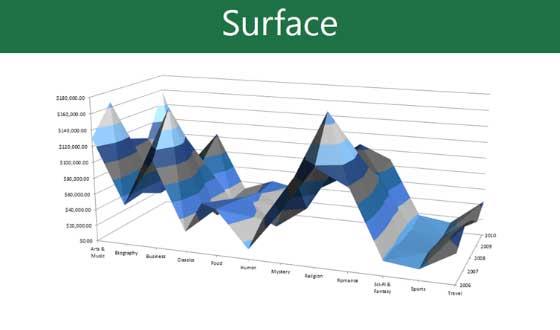
Surface : Surface charts allow you to present data as a 3D scene. This is the best illustration choice for big data, helping viewers see many types of information at the same time.
Identify the parts in the chart
Besides chart types, you need to understand how to read them. A chart contains a number of different pieces of information or sections that help you interpret the data clearly.
- Chart Title : The title should clearly describe the content of the chart.
- Legend : Annotate the meaning of each color on the chart.
- The histogram axes illustrate a value in the data.
Insert a chart into a PowerPoint slide
PowerPoint uses a spreadsheet as a placeholder to import chart data, much like Excel. The data entry process is relatively simple.
Insert a chart
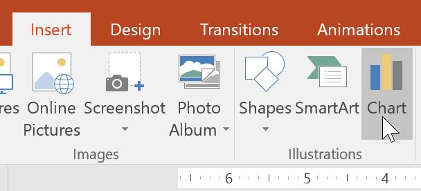
1. Select the Insert tab > click Chart in the Illustrations group .
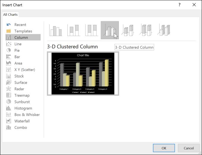
2. A dialog box will appear. Select a category from the left panel and review the chart that appears in the right panel.
3. Select the desired chart, and then click OK .
4. A chart and spreadsheet will appear. The data in that table is placeholder source data that you'll replace with your own information. This source data is used to generate graphs.
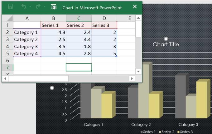
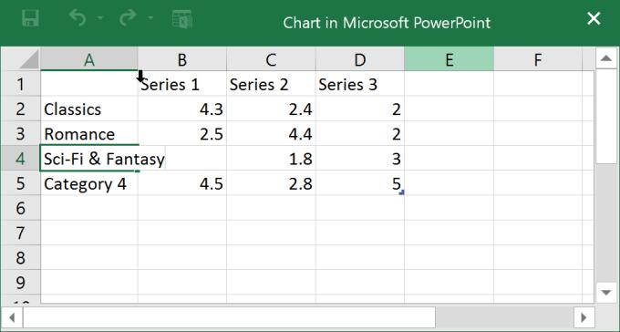
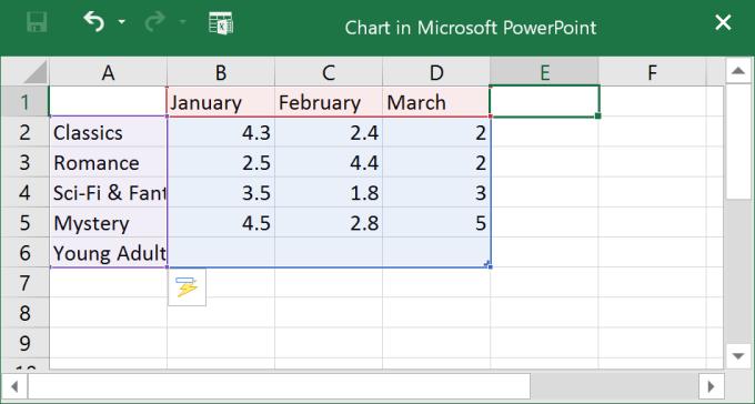
5. Enter data inside the spreadsheet.
6. Only data enclosed in blue lines appears in the chart, but this area will automatically expand as you continue typing.
7. After data entry is complete, click X to close the workbook.
8. The chart has been drawn by PowerPoint. The following results:
You can edit the data in the chart at any time by selecting the chart and clicking Edit Data on the Design tab .
You can also click Insert Chart in a placeholder to insert a new chart.

Create charts using existing Excel data liệu
If you already have data in an Excel file that you want to use to chart or graph, you can transfer the data by copying & pasting it. Just open that spreadsheet in Excel, select & copy the desired data, and then paste it in the source data area of the chart.
You can also embed an existing Excel chart into a PowerPoint presentation. This is useful when you know you need to update the data in the Excel file and want the chart to automatically update whenever the data in the Excel file is changed.
Edit PowerPoint charts with tools
Microsoft PowerPoint offers many ways to customize and organize charts. For example, PowerPoint allows you to change the chart type, rearrange the data, and even change its layout and style.
Change chart style
If you find the data doesn't fit a certain chart, you can easily change it to a new style. The example in the article will change the chart from column type to line type.
1. Select the chart you want to change. The Design tab will appear to the right of the Ribbon .
2. From the Design tab , click Change Chart Type .
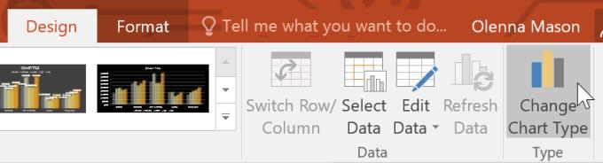
3. A dialog box will appear. Select the desired style, and then click OK .
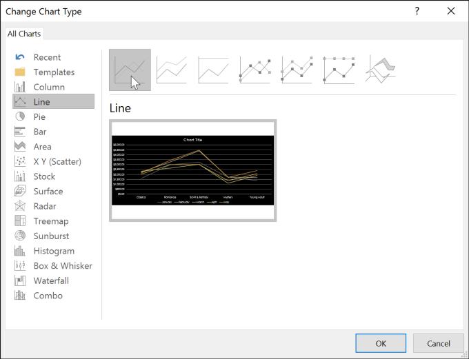
4. A new chart will appear.
Transfer rows and column data
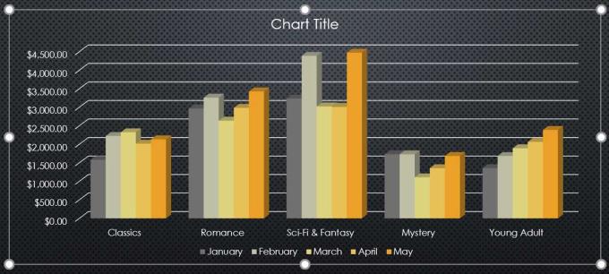
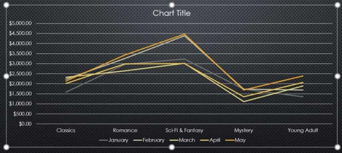
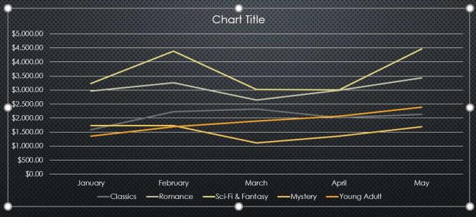
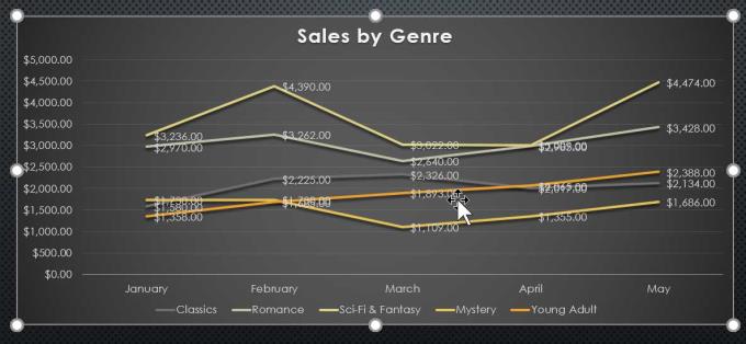
In case you want to change the way the data group graph. For example, in the chart below, book sales are grouped by genre with straight lines for each month. However, you can convert rows and columns to chart groups of data by month, with lines corresponding to each category. In both cases, the chart still shows the same data, just different arrangement.
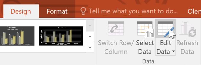
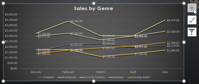
1. Select the chart you want to edit. The Design tab will appear.
2. From the Design tab , select Edit Data in the Data group .
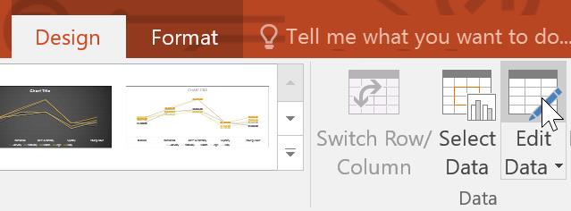
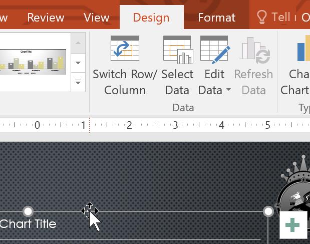
3. Click the chart again, then select Switch Row/Column in the Data group.
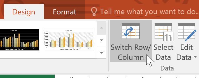
4. The rows and columns will be converted. This example groups data by month with lines for each category.
Note : When numeric data is entered in the first column of a spreadsheet, switching rows and columns can lead to incorrect results. At this point, you should type a ' in front of each number so that the spreadsheet formats it as text instead of a numeric value. For example, enter 2016 as follows: '2016 .
Change chart layout in PowerPoint
The available chart layouts allow you to edit many elements, including titles, captions, and data labels to make them easier to read.
1. Select the chart you want to edit. The Design tab will appear.
2. From the Design tab , click Quick Layout .
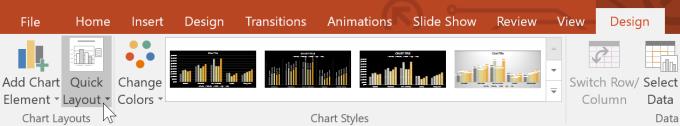
3. Select the desired layout from the menu that appears.
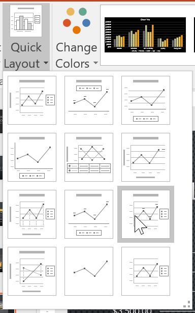
4. The chart will be updated, switch to the new layout.
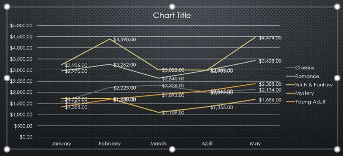
To change an element in the chart, click on it and type what you want.

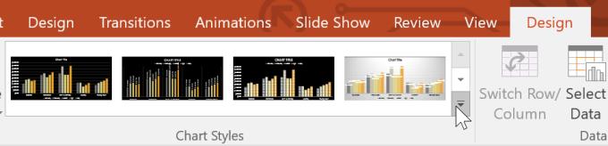
Change chart style
Chart styles allow you to quickly edit their design.
1. Select the chart you want to edit. The Design tab will appear.
2. From the Design tab , click More in Chart Styles .
3. Select the desired style from the menu that appears.
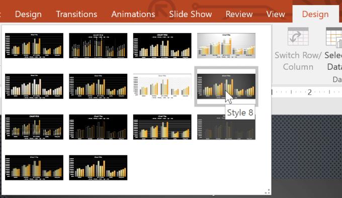
4. The chart will appear in the style you selected.
You can also use chart formatting shortcuts to quickly add elements, change styles, and filter chart data.
Video tutorial for using charts in PowerPoint


 in Google Sheets")
")


